
Skog Forestry
Branding Framework | Forestry & Woodlot Management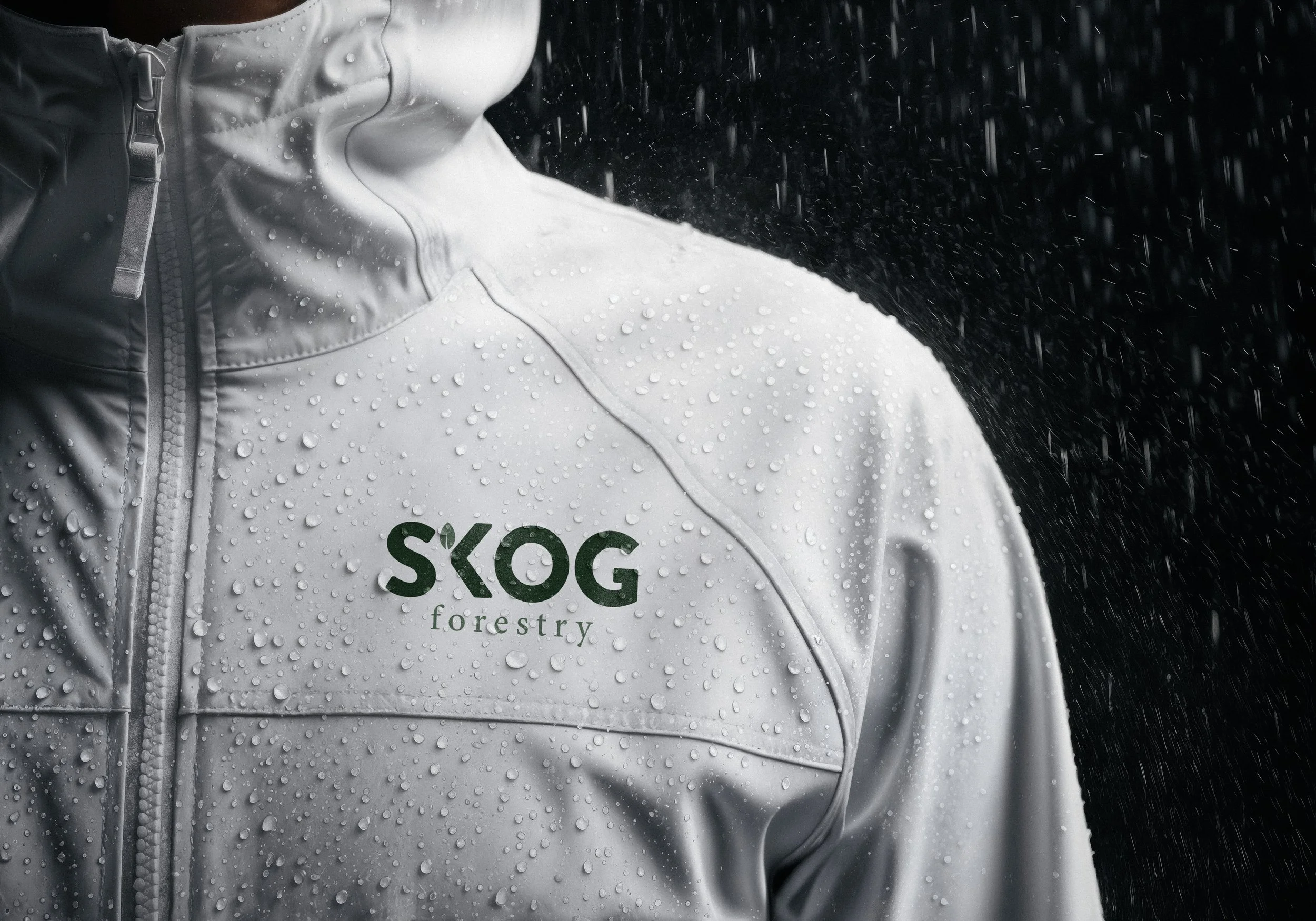
How it Started
Having previously worked with Chad on the visual identity for his construction company, I was excited when he approached me with another venture. Based in Golden, BC, SKOG Forestry was taking shape as a different kind of forestry business, rooted in sustainability, purposeful craftsmanship, and respect for the land. The goal was to create an identity that reflected this philosophy while establishing SKOG as a brand in its own right.
What They Needed
SKOG needed an identity that would stand apart from traditional forestry companies while reflecting the practical, rugged nature of the industry. Inspired by Scandinavian simplicity, the challenge was to create something clean, modern, and understated that communicated the company's thoughtful approach to forestry without relying on conventional industry imagery.
Where We Landed
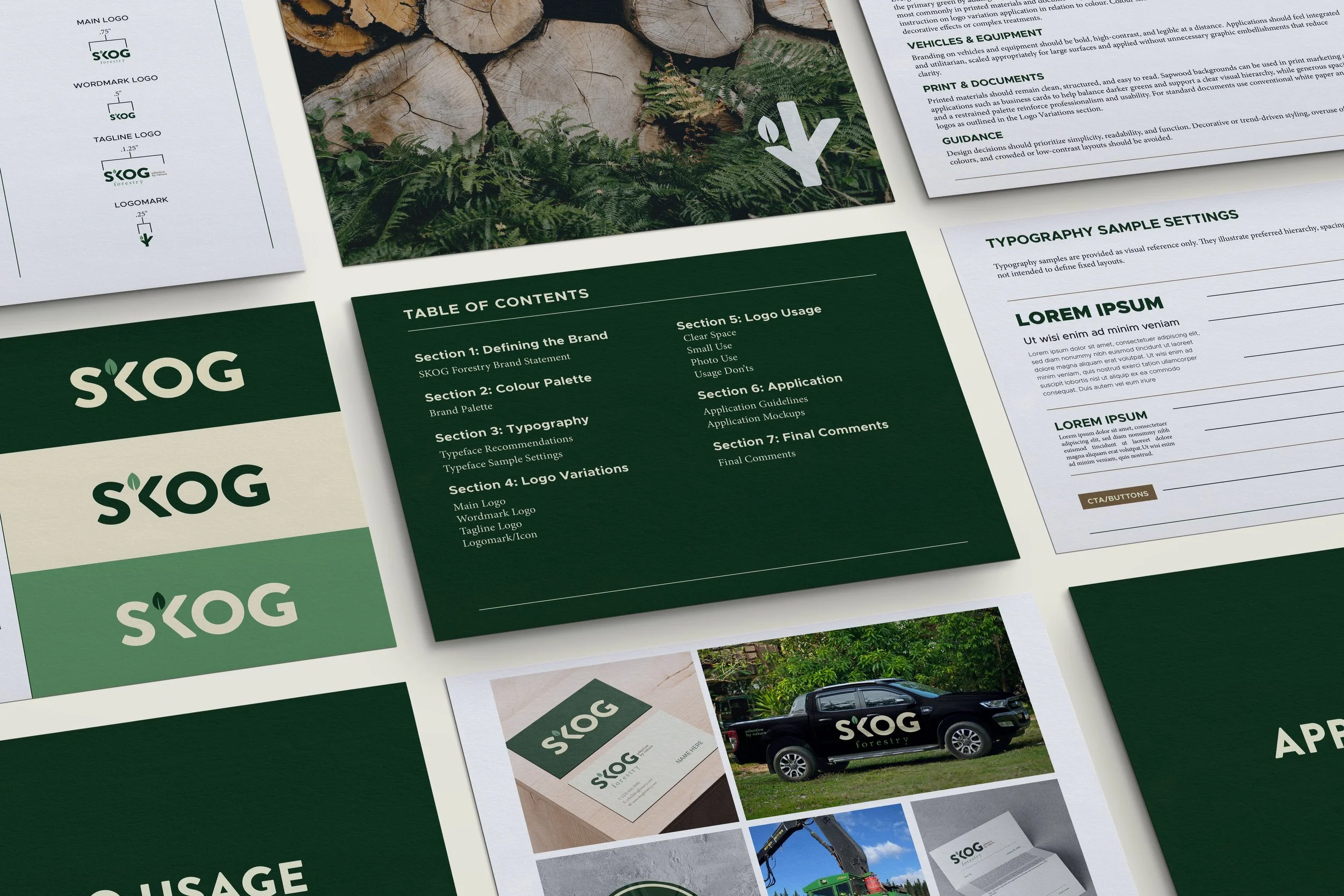
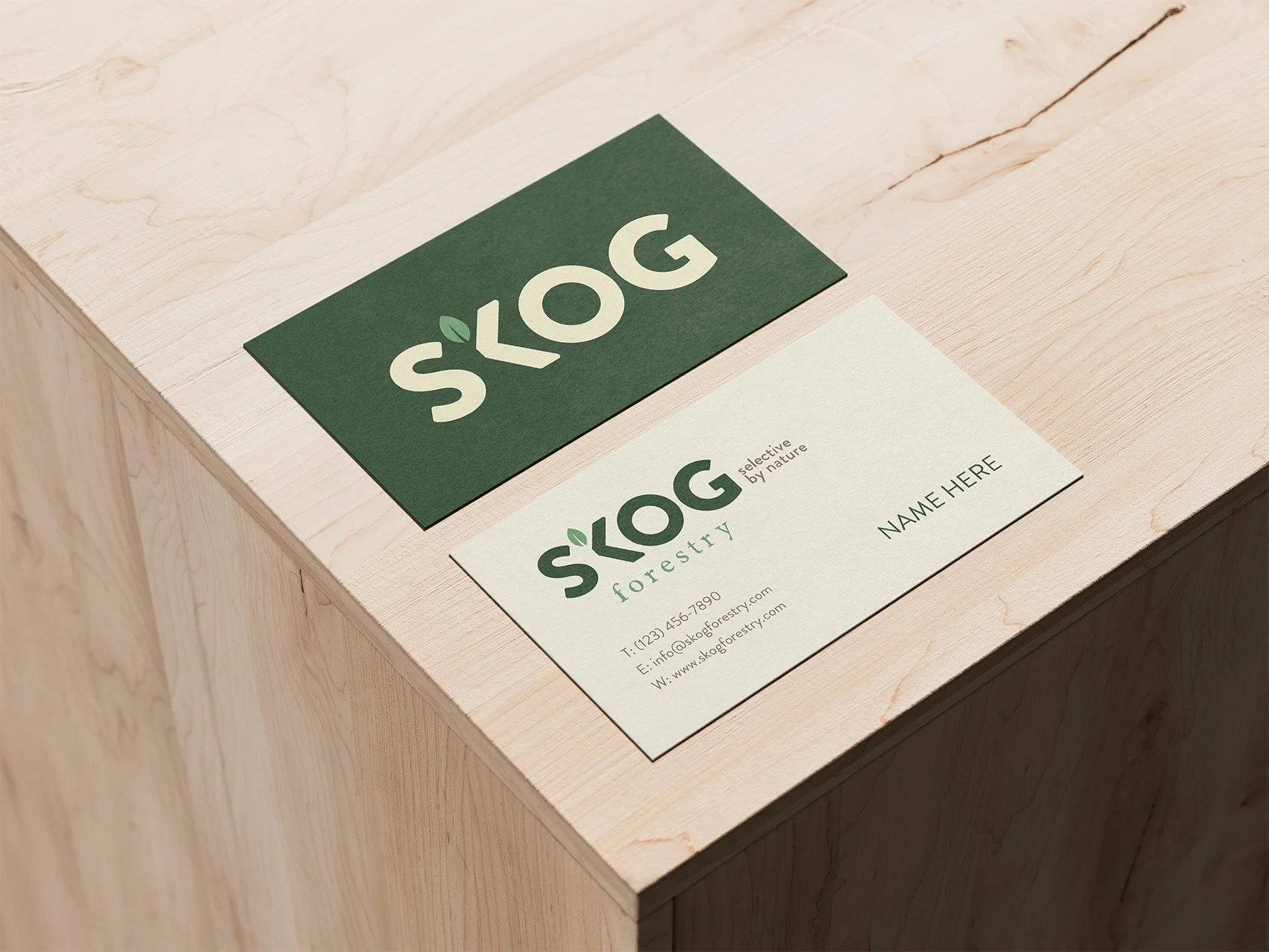
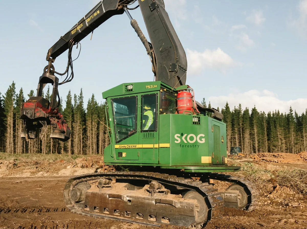
The result was a bold yet understated visual identity that balances Scandinavian simplicity with the rugged character of the forestry industry. A custom wordmark incorporating a subtle leaf detail, a restrained nature-inspired colour palette, and a versatile logo system create a distinctive brand that feels modern, grounded, and equally at home on business materials and working equipment.

What I Loved
I loved the opportunity to challenge the visual expectations of a traditionally rugged industry. While I've worked with many businesses in the trades, this was my first forestry-specific project, bringing a fresh perspective and a new creative challenge.
SKOG's thoughtful approach to forestry made it especially rewarding to explore how simple forms, natural colours, and subtle details could communicate so much about a business without relying on the familiar visual clichés of the industry.