
Elevation Barber Co.
Logo Foundation | Barbering Products 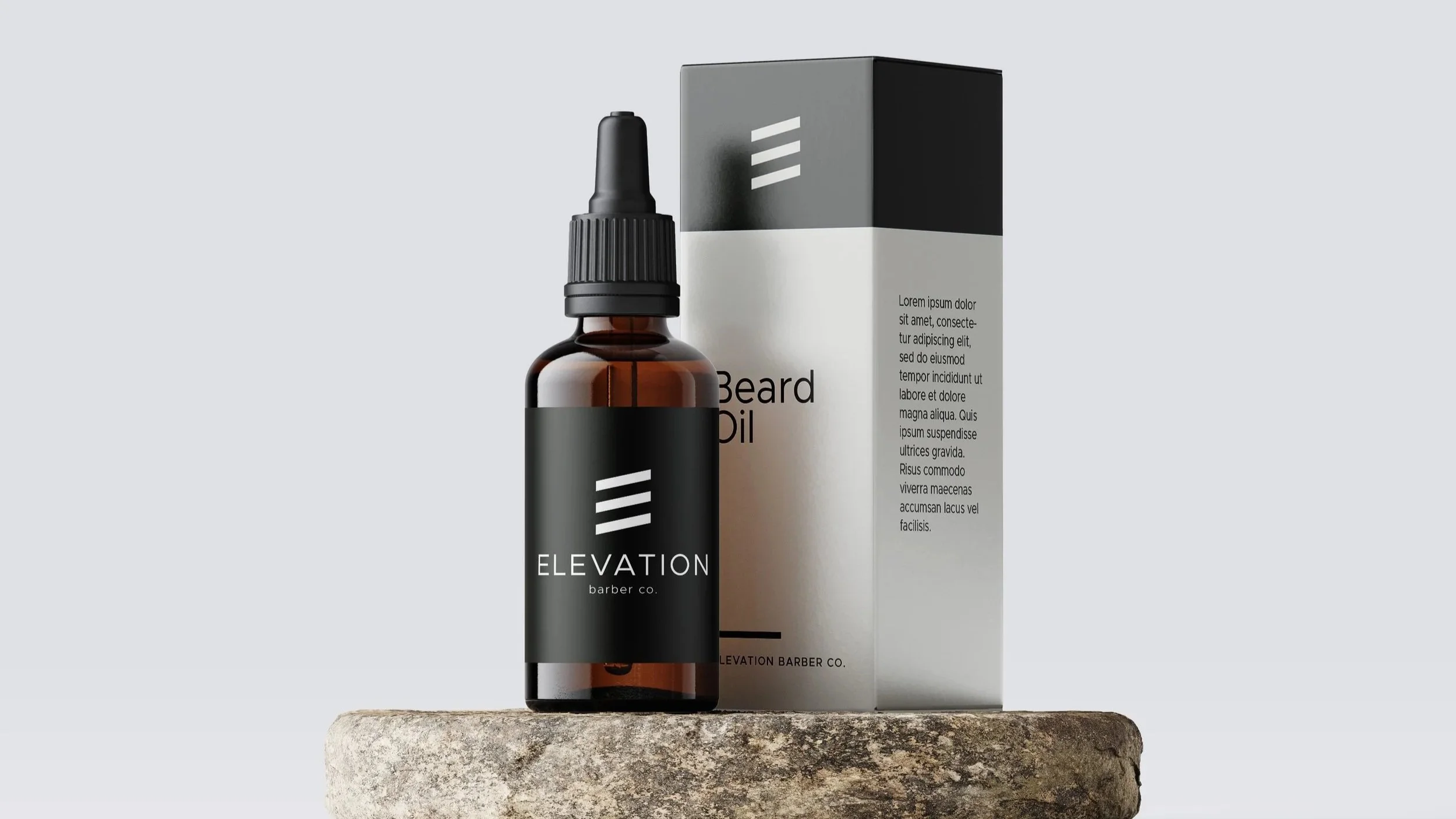
How it Started
Liz has been my hairstylist for over a decade, and in that time, I've watched her entrepreneurial spirit lead to some exciting new ventures. Always ambitious, she's never one to shy away from a new opportunity. So when she approached me about creating a logo for her latest idea, a barbering products venture called Elevation Barber Company, I was excited to have the opportunity to contribute to another chapter of her entrepreneurial journey.
What They Needed
As a new business, Elevation needed a strong, recognizable logo to establish its presence. The goal was to create something clean, modern, and professional, with a nod to traditional barbering without relying on the usual industry imagery...no classic hipster moustache/beard illustration.
A simple, versatile design would give the business a solid visual foundation that could work across a variety of applications.
Where We Landed
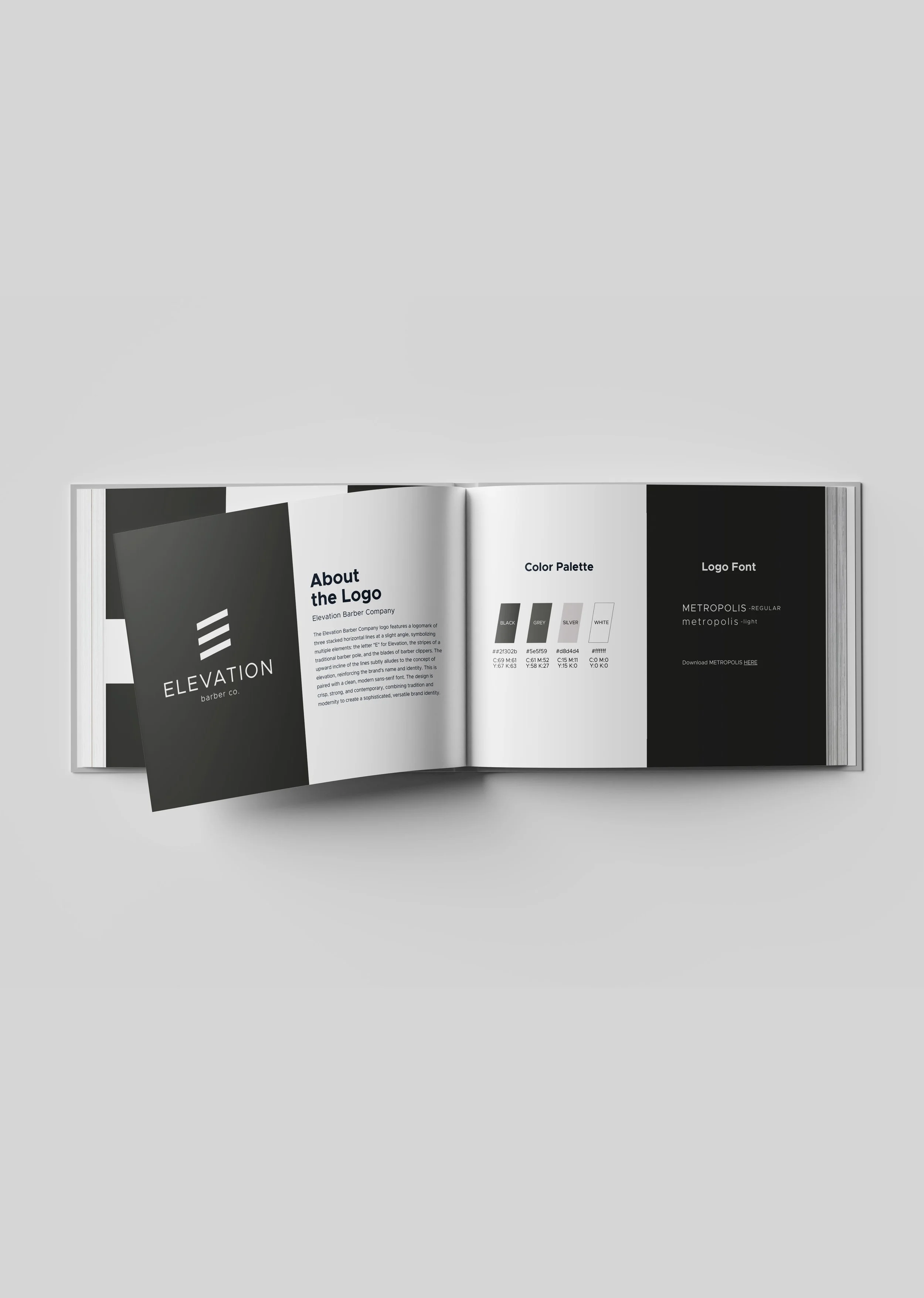
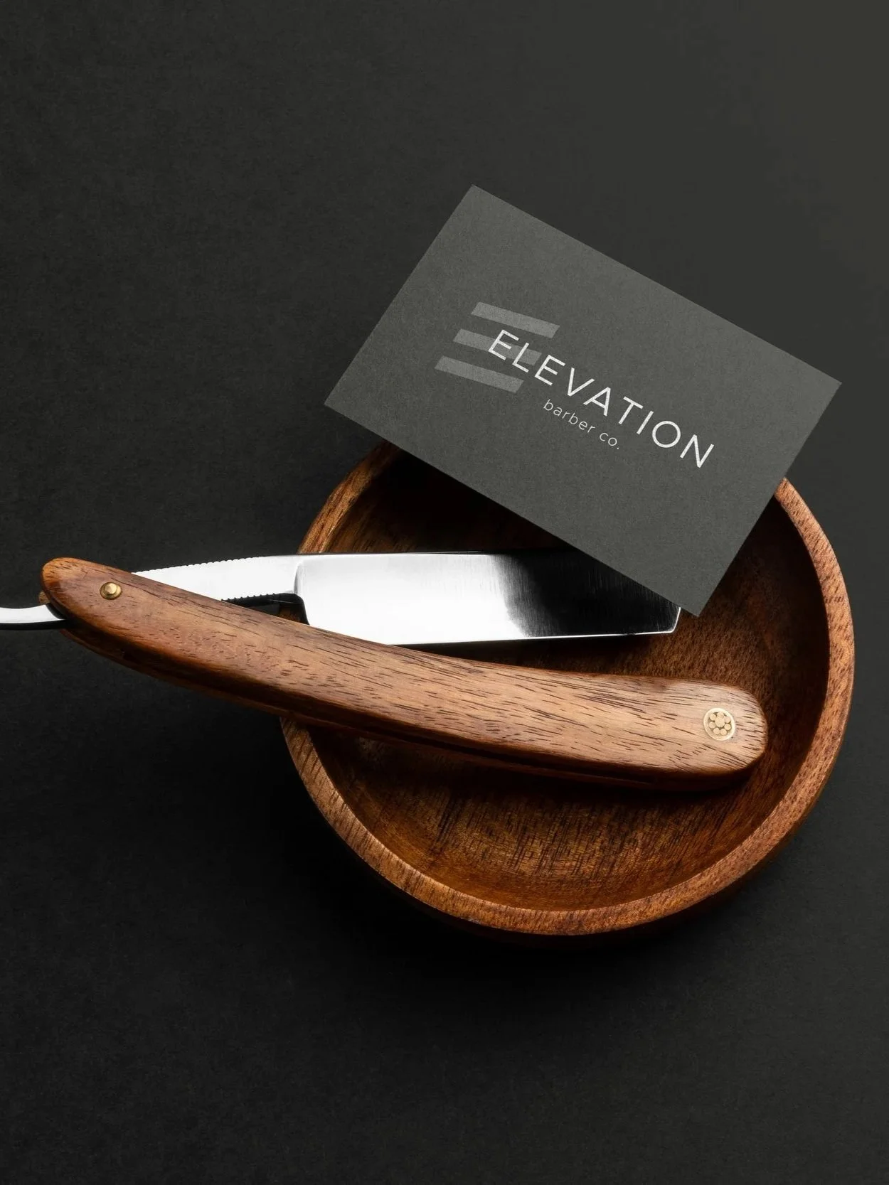
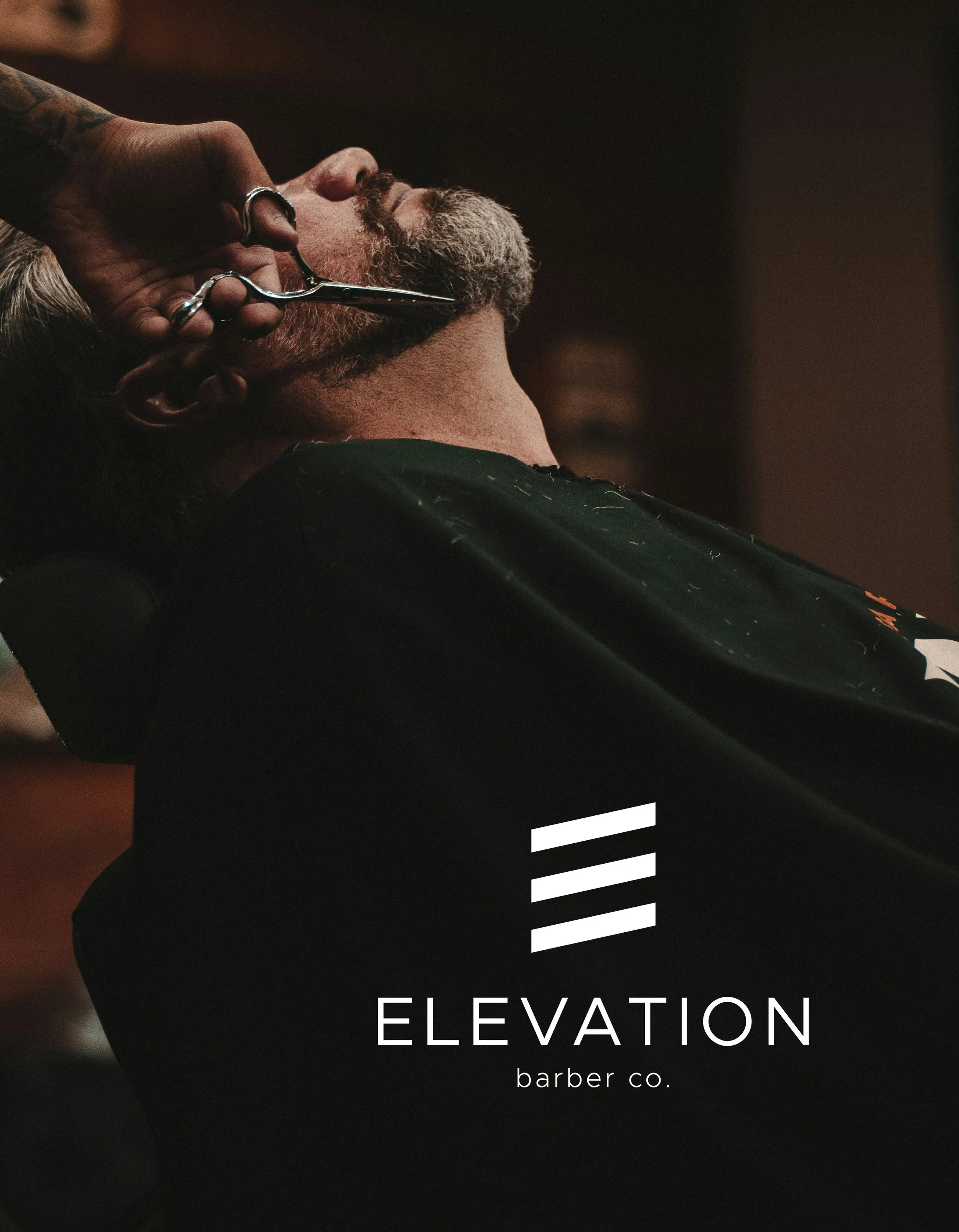
The result is a bold, minimalist logo built around a distinctive three-line symbol. The angled lines cleverly reference the letter E, the stripes of a traditional barber pole, and the blades of barber clippers, while their upward direction reinforces the name Elevation. Paired with clean, contemporary typography and a restrained monochromatic palette, the design strikes a balance between traditional barbering and modern sophistication.
What I Loved
What I especially loved about this project was the opportunity to create something simple but meaningful. It's a great example of how a thoughtfully designed logo doesn't need to be complicated to communicate a strong idea. Sometimes a few well-considered elements are all it takes to make a memorable mark.